Kelly Lucas Say hello

Design desk

A swipe file for UI, kept in public. I learn design by paying attention, and this is where I keep what I notice. Magpie files every new clip into the right pile on its own.

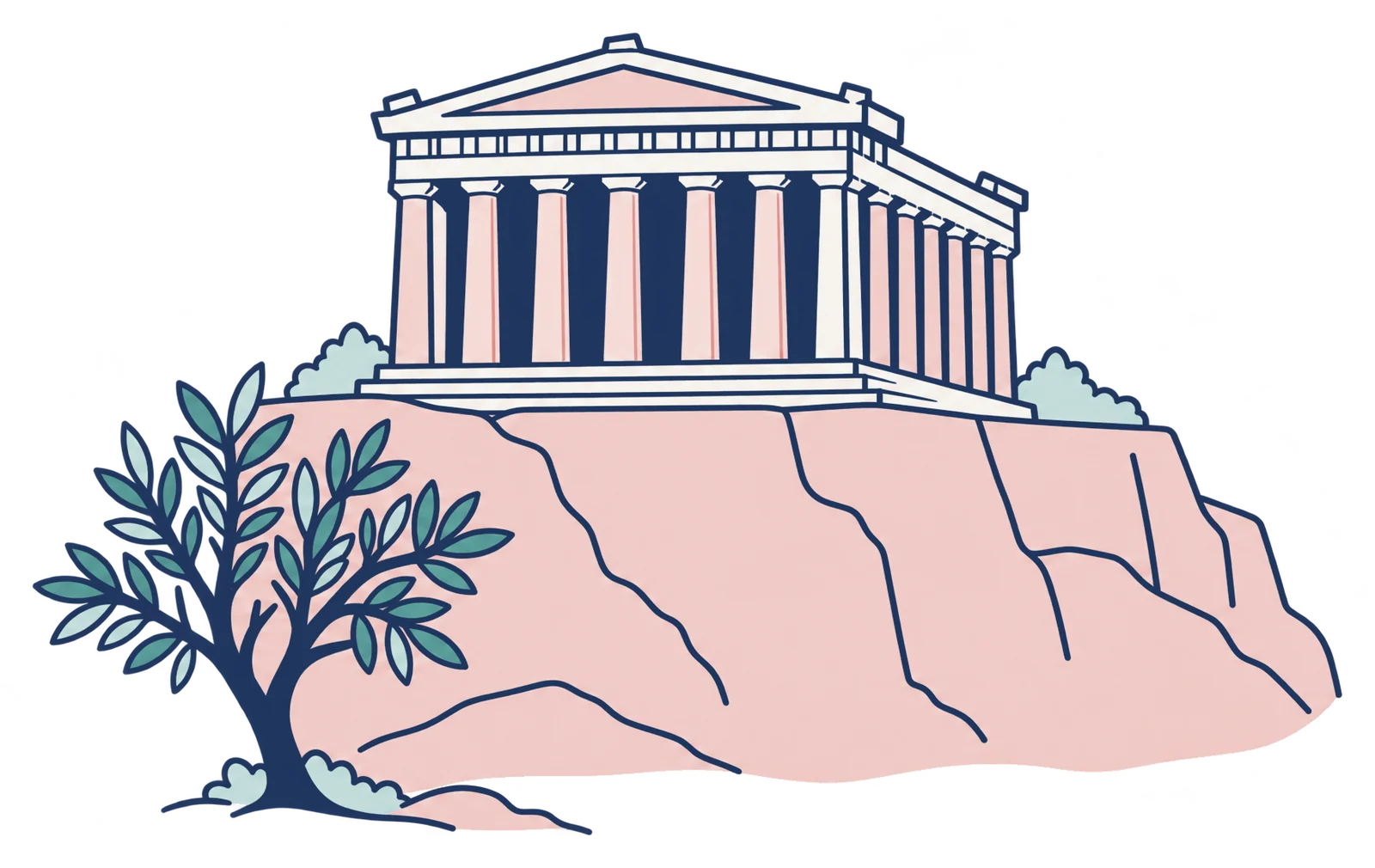
A drawing of the Parthenon on the Acropolis rock, with an olive tree in front.

The HelioFlux website

The systems

Documents and the style pack

Libraries

    Clipped for it

    Heliopolis

    The system

    Documents and drawings

    Libraries

      Clipped for it

      Pretzel Protocol

      The system

      Documents and drawings

      Libraries

        Clipped for it

        Resources

        Videos I keep going back to

        Three pages, transcribed

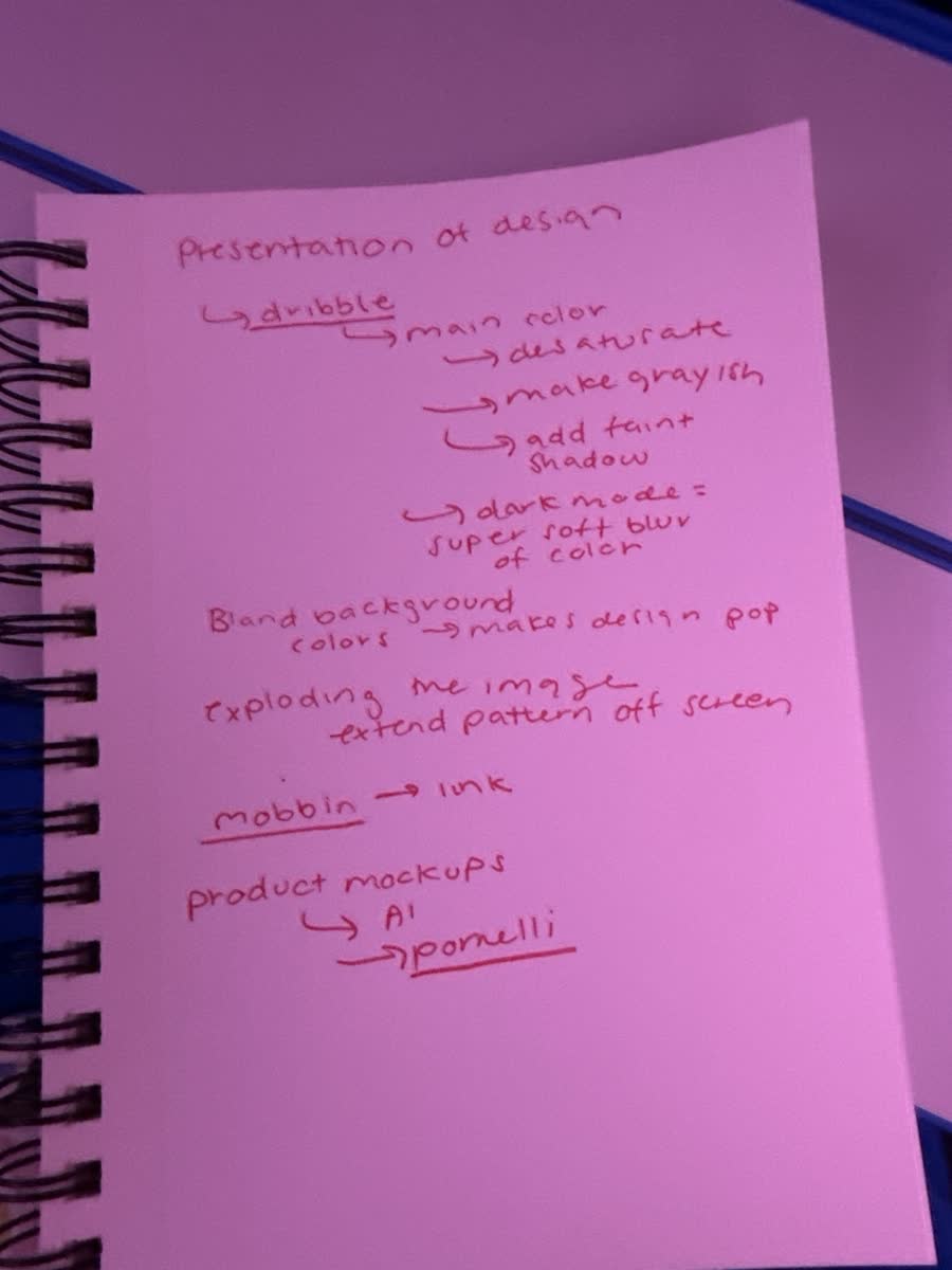
        Notebook page in red pen: presentation of design (opens in a new tab)

        Presentation of design

        Page 1, red pen

        • The Dribbble trick for a main color: desaturate it, make it grayish, then add a faint shadow.
        • Dark mode is a super soft blur of color, not a black slab.
        • Bland background colors make the design pop.
        • Exploding an image: let the pattern extend off screen.
        • Mobbin for real product flows. Link it up.
        • Product mockups: try AI, try Pomelli.
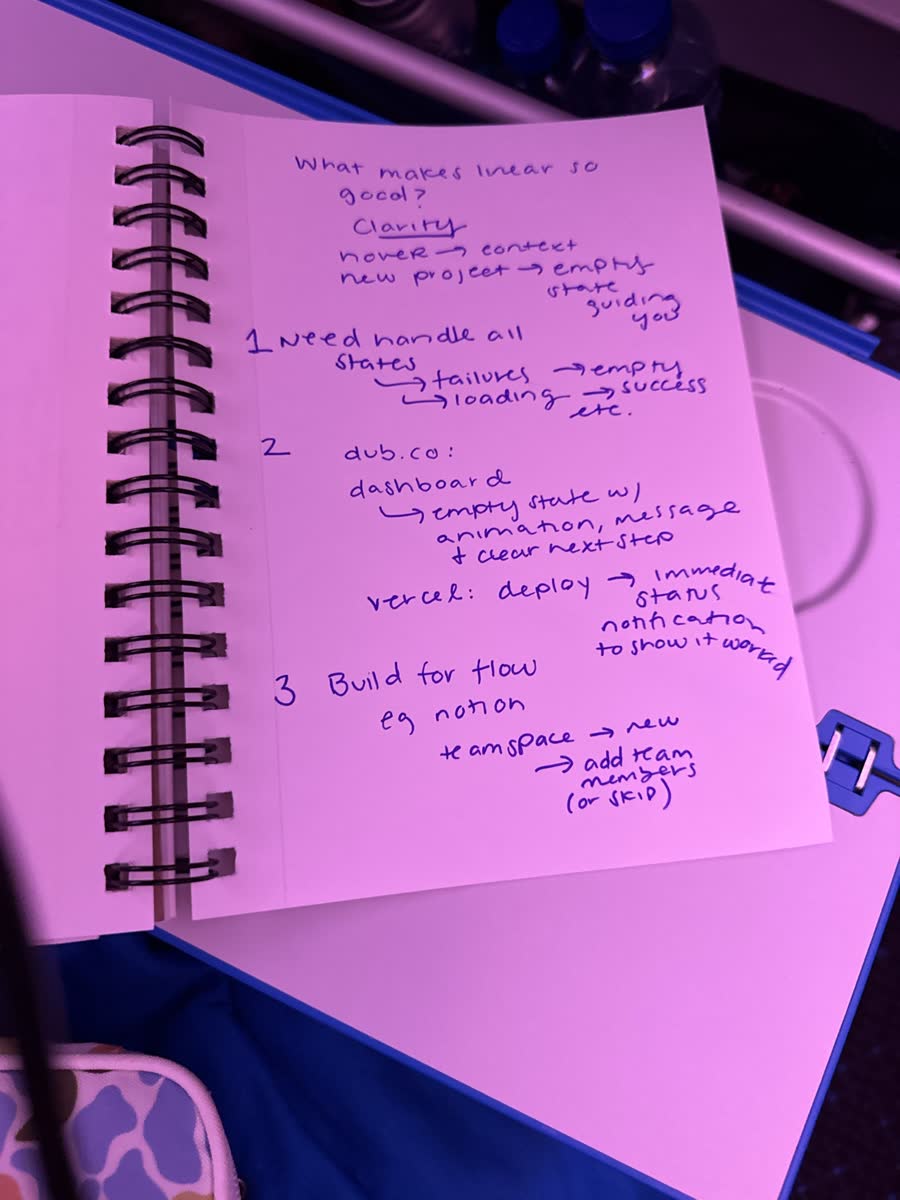
        Notebook page in blue pen: what makes Linear so good (opens in a new tab)

        What makes Linear so good?

        Page 2, blue pen. Answer: clarity.

        • Hover gives you context. A new project gets an empty state that guides you.
        • 1. Handle all the states: failure, empty, loading, success, and the rest.
        • 2. dub.co: the empty dashboard has an animation, a message, and a clear next step. Vercel: deploy, and the status shows immediately so you know it worked.
        • 3. Build for flow. Notion: new teamspace, add team members, or skip.
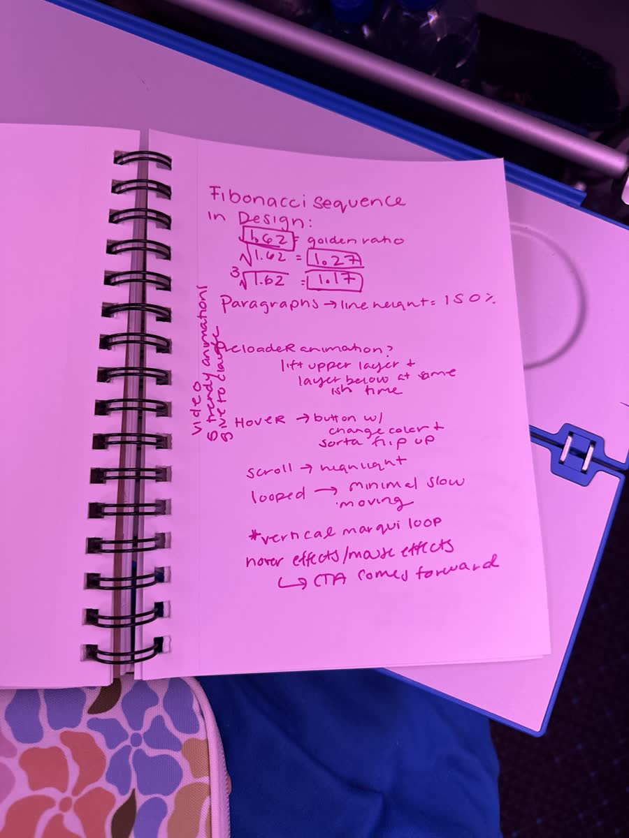
        Notebook page in pink pen: Fibonacci in design (opens in a new tab)

        Fibonacci in design

        Page 3, pink pen

        • 1.618 is the golden ratio. Its square root is 1.27. Its cube root is 1.17.
        • Paragraphs: line height 150%.
        • Preloader idea: lift the upper layer and the layer below at almost the same time.
        • Hover: a button that changes color and sort of flips up.
        • Scroll: highlight as you go. Loops: minimal and slow moving. A vertical marquee loop.
        • Mouse effects: the CTA comes forward.
        • Margin note: find the "5 trendy animations" video, give it to Claude.

        Try the ratios

        Display

        A heading

        Body copy at 150% line height.

        Small print

        Examples

        This site

        Libraries

          How this page fills itself

          The Chrome feather already existed. Now it knows where things go.

          1. Clip

            Hit the Magpie feather on any page. The popup guesses the pile from the address, the tags and what I wrote: the website, Heliopolis, Pretzel, resources or examples. I change it if it guessed wrong, or say not for the desk.

          2. Sync

            npm run sync:design rebuilds design-library.js from every desk clip and files each one under its pile. The rules live in lib/desk-rules.json.

          3. Push

            Push to main. Vercel deploys, the piles update, and the video notes fill in.

          Open full size (opens in a new tab)